

UX usability is not rocket science. In fact, despite how much computers have changed over the pastfew decades, many of the core principles have remained more or less the same.After all, human beings aren't fundamentally different now- we still have thesame brains as our ancestors thousands of years ago!
One of the most influential lists of UX usability heuristics was written by Jakob Nielsen, a UX researcher, back in 1994. They are still commonly cited by specialists today. Although there are other rules to keep in mind, these are a great place to start. The principles fall into the following 10 categories:
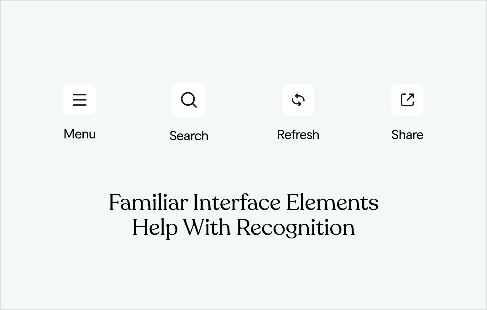
- Visibility of System Status
- Match Between the System and the Real World
- User Control and Freedom
- Consistency and Standards
- Error Prevention
- Recognition Rather than Recall
- Flexibility and Efficiency of Use
- Aesthetic and Minimalist Design
- Help Users Recognise, Diagnose, and Recover fromErrors
- Help and Documentation
Visibility of System Status
It should be easy for users to keep track of what's going on. They should always have immediate access to the information they need whenever they need it.
Of course, this looks different depending on what kind of app they are using. The most relevant information to show for a health app is going to be quite different from that for a food delivery app.
Consider which UI elements would be most appropriate for each piece of information you want to present.Quantitative information can be presented by bars or numbers, but depending on the nature of your app, one might be better than the other.
Also consider what information to present at what times. Providing every single detail about the system status can be overwhelming for a new user, so it often makes sense to present only the most relevant information for each screen.
Suppose your food delivery app has a map screen for selecting location. The amount of money the user has in their account might not be worth showing on that screen, but a dot showing their geolocation would be. And on the payment screen, the money they have in their account should be indicated with a number.
Match between the System and the Real World
The very first GUIs were revolutionary in that they used pictures to represent a digital office.Icons of folders, floppy disks, and trash cans gave users an immediate sense of what everything was for.
Over time, there has been a tendency towards abstraction. Old school iOS graphics were concrete, but now they are minimal and streamlined. This reflects the familiarity that users now have with smartphones.
Even so, the best way to make usable interfaces is to ensure that its components are familiar and logical:
Avoid jargon. Use natural language for describing things.
Present information in a natural order. Keep in mind the flow of decisions that each user has to make.
Rely on research for determining the vocabulary most familiar to your users.
In general, you want your app to feel like it is continuous with and reflective of the rest of the world. It should not feel like its own little universe.
User Control and Freedom
You can safely assume that many users will make some kind of mistake when using their app.Maybe they tapped "Purchase" on accident, or typed their height in inches instead of centimeters.
Ideally, your design should minimize the chance of this happening, by making user interaction as smooth and intuitive as possible. But users will somehow always find a way to perform an unwanted action, so they need a clearly marked "emergency exit" or opportunity to reverse course.
When you place an order on Uber Eats, for example, the last screen has a "Cancel Order" button for a few seconds. The only other information present is address and order information, giving users a chance to make one final check that their order is correct.
Aim to support both Undo and Redo operations, when appropriate.
Make sure to use familiar icons for each, such asa circular arrow with labels.
Overall, always ask yourself what actions users might want to take on each screen, and make it easy for them to do so.
Consistency and Standards
Don't reinvent the wheel if you don't have to.
Users will spend 90% of their time using apps other than yours (no matter how amazing your product is!) This means that they will be most familiar with interface elements that are already common in other apps.
A red "X"will always mean cancel or quit. A vertical bar with arrows on the side of the screen will always be for scrolling.
This does not mean, however, that you shouldn't be creative. There is always room for improvement. If you can find a genuinely better approach to a certain UI element, go for it. Just be wary of radically changing design concepts soubiquitous that even a subtle shift would be jarring.
If there are any, follow industry standards relevant to your app.
A good user interface is like a good picture frame- it doesn't stand out by itself. Instead, it showcases what's inside.
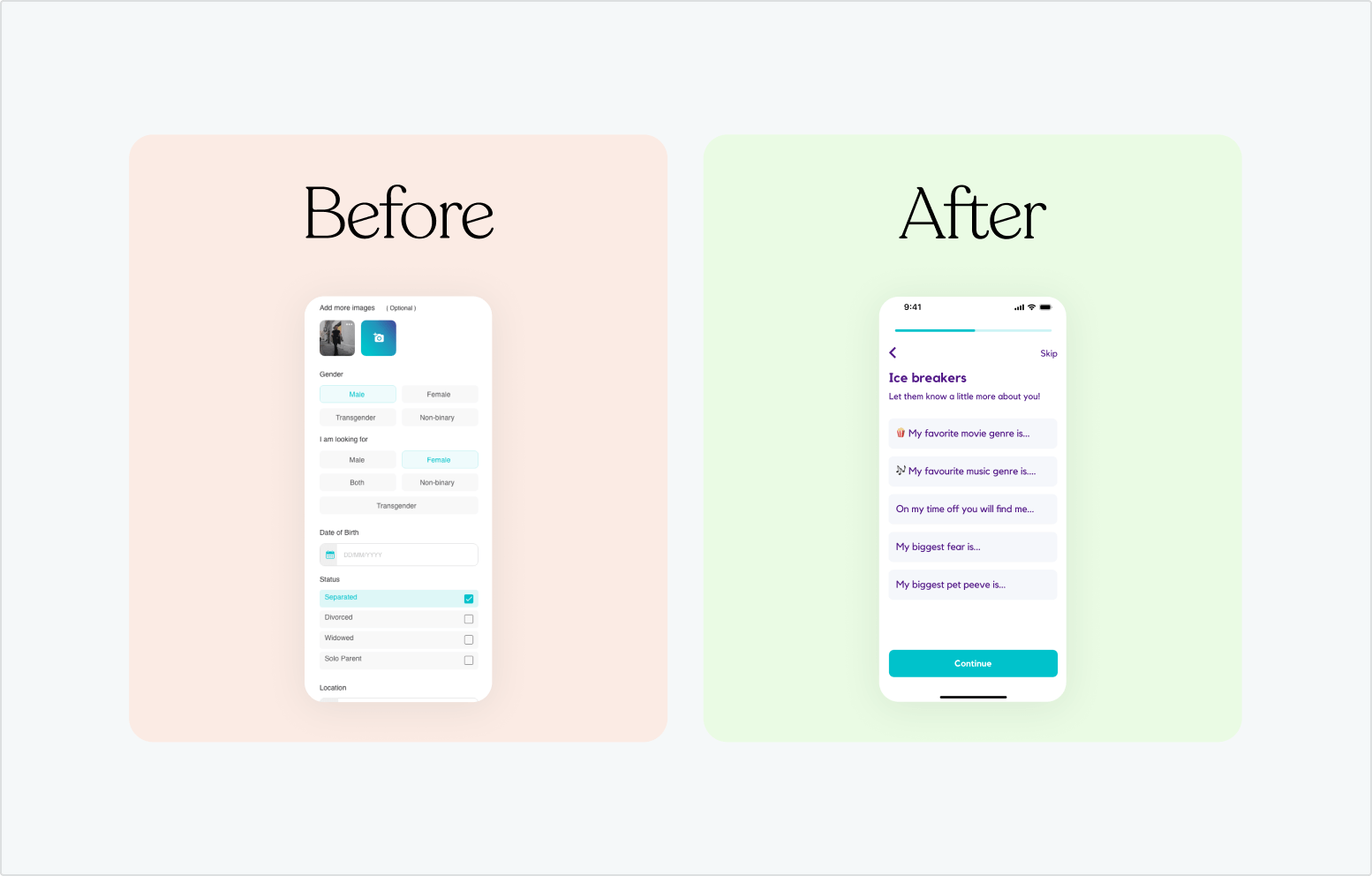
Error Prevention
As in medicine, prevention is better than a cure. The best designs prevent problems from occurring in the first place.
One thing you can do is present a confirmation option before committing to certain actions. A signup page has users type in their new password twice for precisely this reason.
Keep in mind that there are two types of errors that users can make: slips and mistakes.
- Slips are unintentional, accidental errors, such as a"fat finger" hitting the wrong button.
- Mistakes are conscious errors driven by a misunderstanding of how the app works
Ideally, you should avoid mistakes by ensuring that your design is clear and intuitive. Slips can never be completely avoided, but you should strive to minimize their risk by doing things like making buttons big enough and clearly demarcating different UI elements.
Recognition rather than Recall
As the internet gradually erodes attention spans, it is increasingly important to minimize the user's memory load. Make relevant elements, actions, and options visible so that they don't have to think about where to go and what to do next.
Instead of giving users a long tutorial and expecting them to remember everything, give help in context as needed. Small info popups and tooltips help to remind users of their options.
Many kinds of apps have common design schemas in place already. For example, virtually all short form video apps will have a like button, a comment button, and a hamburger button. These icons are easily recognized, and unobtrusive.
Flexibility and Efficiency of Use
Different types of users will use your app. You should consider carefully who they are, and how they behave, so that you can accommodate everyone.
One way to divide up users is near universal: new users vs expert users. Those who are new to your app will need a simpler interface and more training. Expert users may find tutorials distracting, and prefer relying on shortcuts. It is common to keep these shortcuts slightly hidden, so as to not distract novices until they are comfortable enough with the app.
In any case, your overall design should be flexible enough that it can adapt to the preferences of each user. This can be done automatically, by subtly changing the behavior of the app in response to user behavior. Or it can be done directly, be asking the user at the start what type of experience they want to have.
Aesthetic and Minimalist Design
Smartphone screens are not that big. Space is at a premium. Emphasize relevant and useful information, while minimizing that which is rarely needed.
For every screen on an app, the user should have one primary goal or action in mind. The screen should present exactly what they need to move forward towards that goal, while keeping functionality for moving back and performing a different action.
Focus on essentials. Every piece of information on the screen competes with every other piece for attention.
Prioritize which features are most relevant. Sometimes you will have to make a judgment call about what to cut.
Be careful to avoid cutting out too much, however. It is possible to make an icon or button too abstract to the point that its use becomes unclear to users.
Help Users Recognize, Diagnose, and Recover from Errors
As mentioned earlier, you should strive to prevent errors, but they will always be unavoidable. When a user does make an error, you should have features in place to make it easy to recover from.
Avoid numbered error codes. This is a relic from a bygone era when programmers had to go look up error codes in a book. Assuming your users are not so technical, a plain language description would be better.
Add visual treatments to help explain what went wrong. This helps users quickly notice and understand the mistake.
Offer a quick solution when available. Many problems have common fixes. A simple message like "Did you mean to do X?" can be useful here.
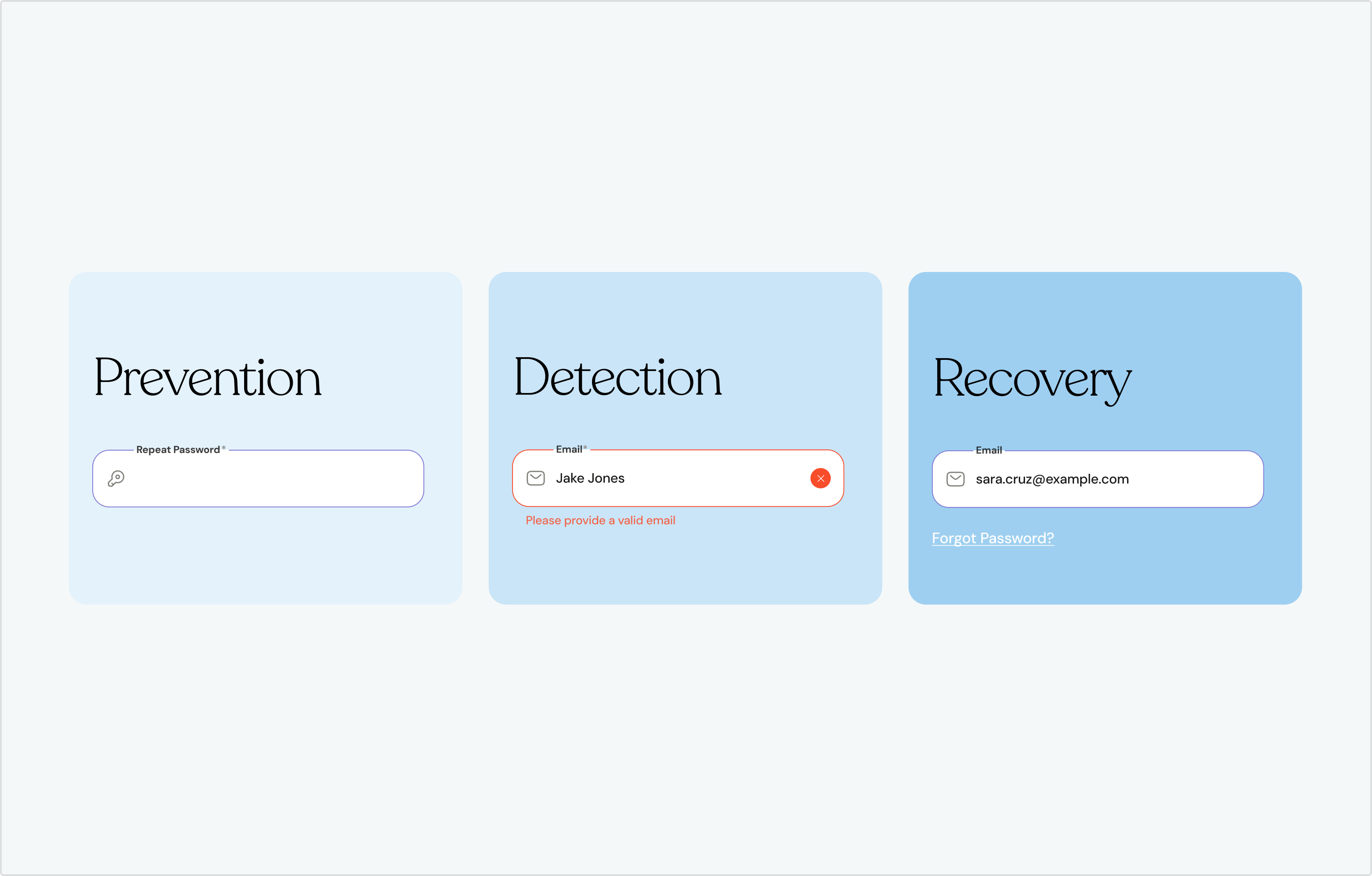
Help and Documentation
In a perfect world, your app would be so easy to use that it would never require any help or instruction. But in reality, even the best designed programs need some amount of help and documentation.
Make documentation easy to search. Frequently asked questions should be quickly available. It may even be possible to use AI to help users find a solution to their problem.
Try to present information in context. Give users the help they need when they need it.
Give users concrete steps and actions to take, rather than speaking in generalities.
Most apps will require some form of onboarding. This is the ideal time to not only instruct the new user about your app, but also to inform them of its core value proposition.
Final Thoughts- Usability for Modern Technology
Usability is at the core of UX design. Aesthetics are important, too, but if your app is frustrating to use, nobody will want to use it.
Fortunately, there is no secret to making an application easy and intuitive to use. Many of the same principles that worked for computers in 1995 still apply to smartphones and tablets in 2025. We'll close out this article with some suggestions that are more specific to modern technology:
Make sure your application will work across platforms. If you want your app to run on iOS, Android, and PC, you should make slight tweaks for each.
Avoid underlined URL links in your apps. URLs are more suited for websites viewed on computers.
Design for vertical and horizontal orientation in mind. Users may tilt their phones as they will. Decide whether you want your app to function differently for each orientation, or to only work facing one way.
Do you have a digital product you want to bring to life? Let's talk!


